Fredo Restyling
A historical brand renewed through design: timeless identity meets contemporary visual language.
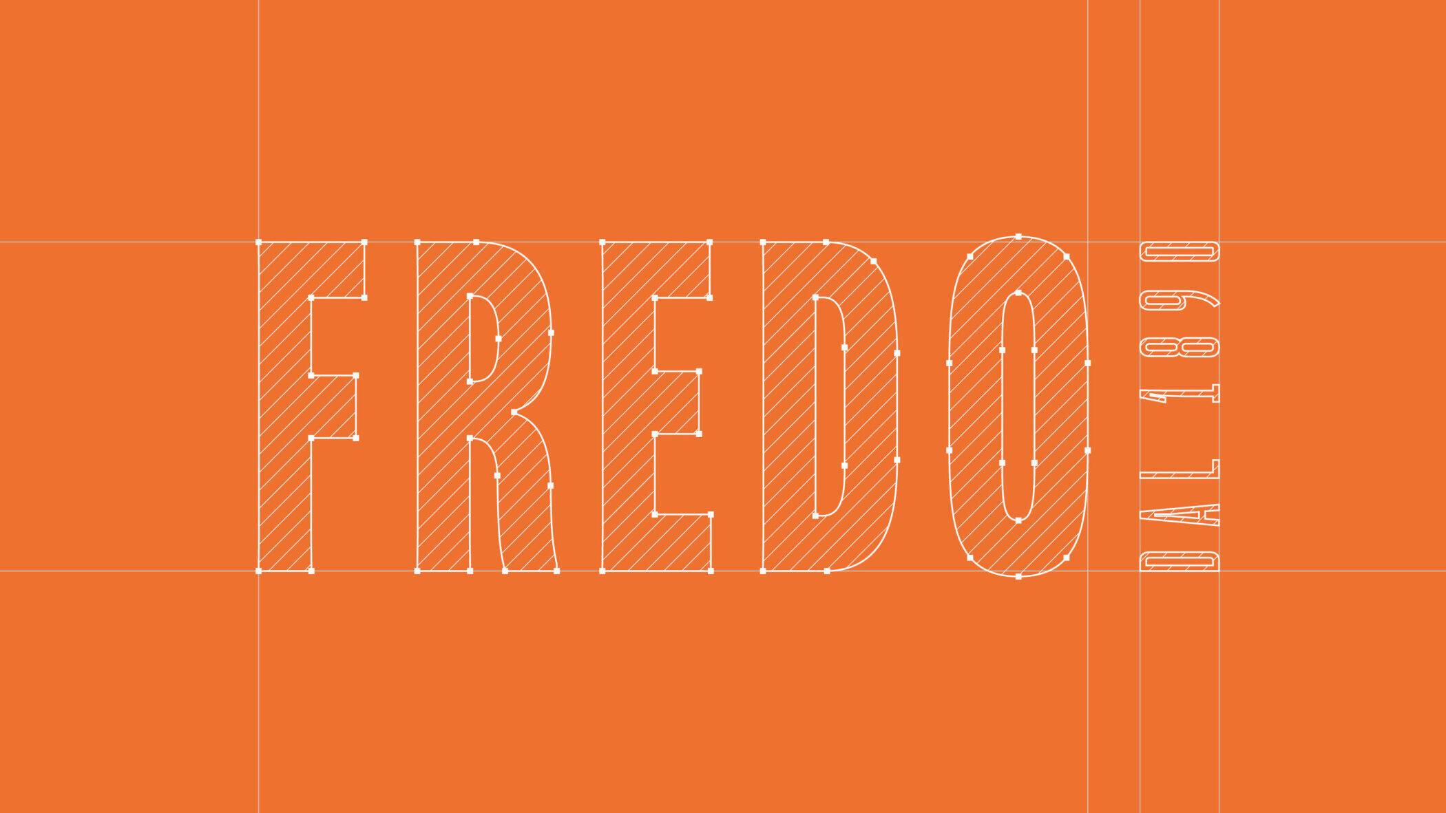
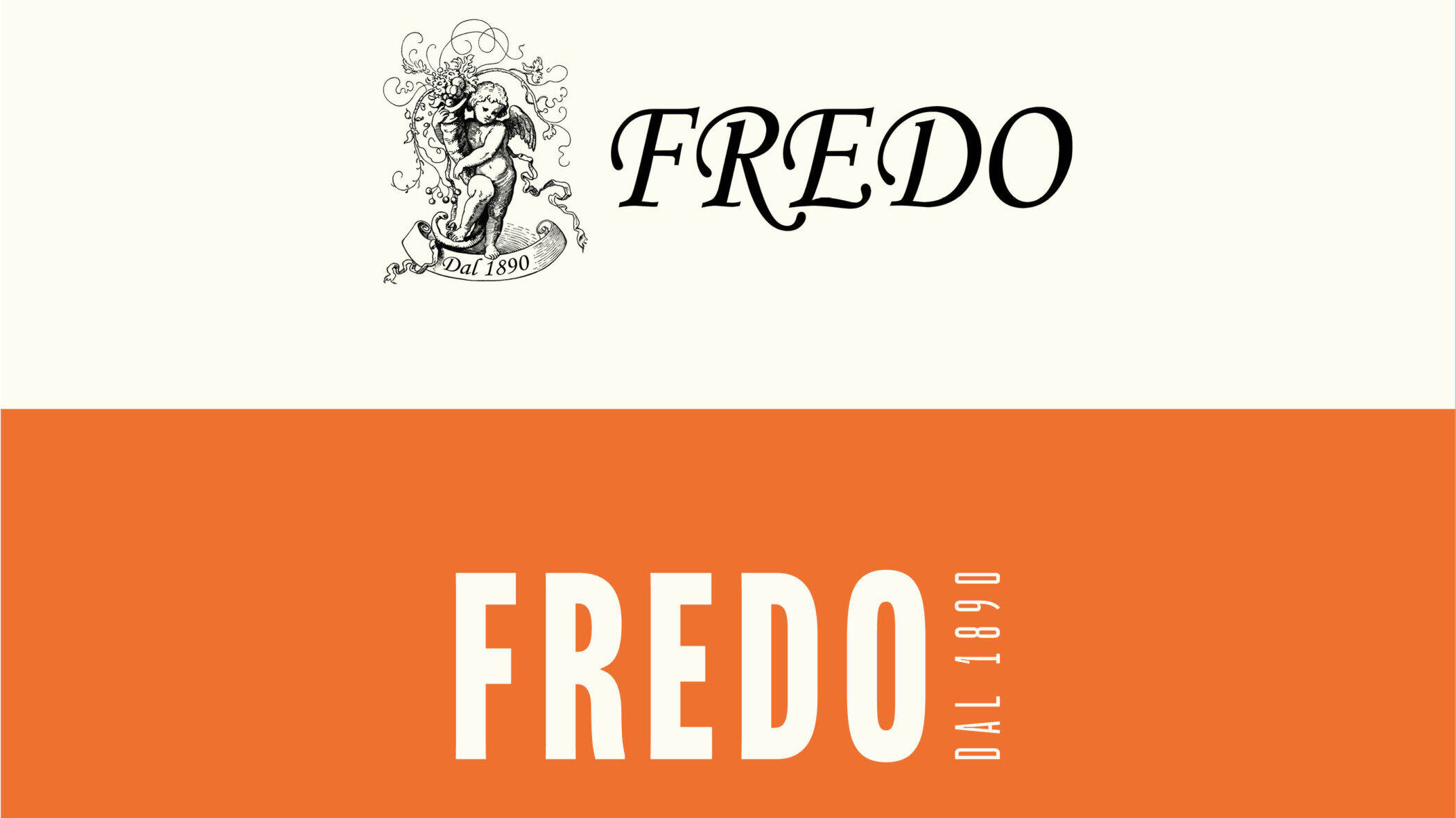
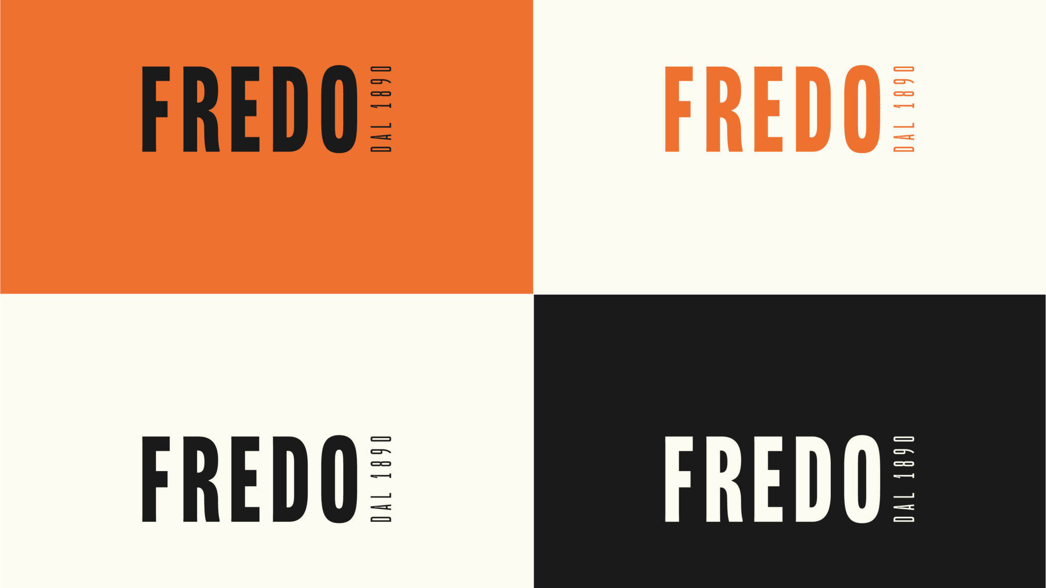
Brand Identity
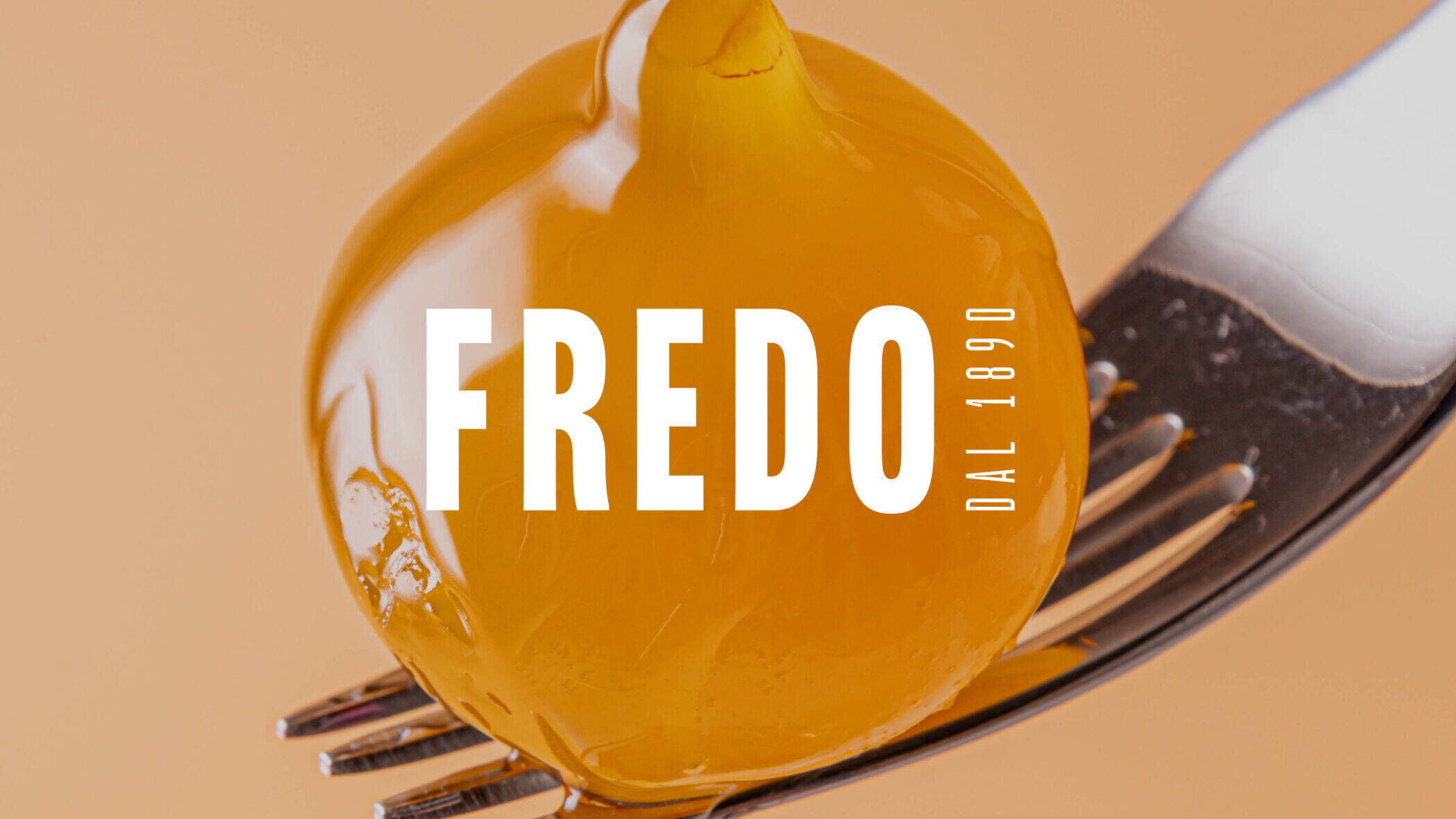
Product photography
About the project
The Fredo rebranding project aims to modernize a historic artisanal brand while preserving its deep-rooted identity. The new visual system enhances product visibility, coherence, and emotional value, merging tradition and contemporary design to express quality, authenticity, and uniqueness.
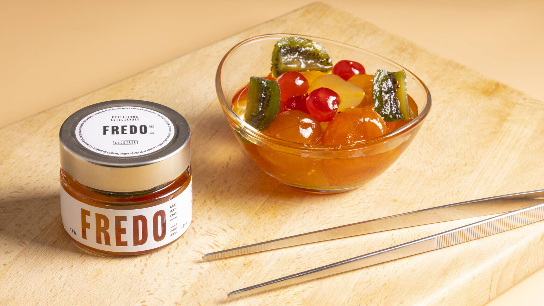
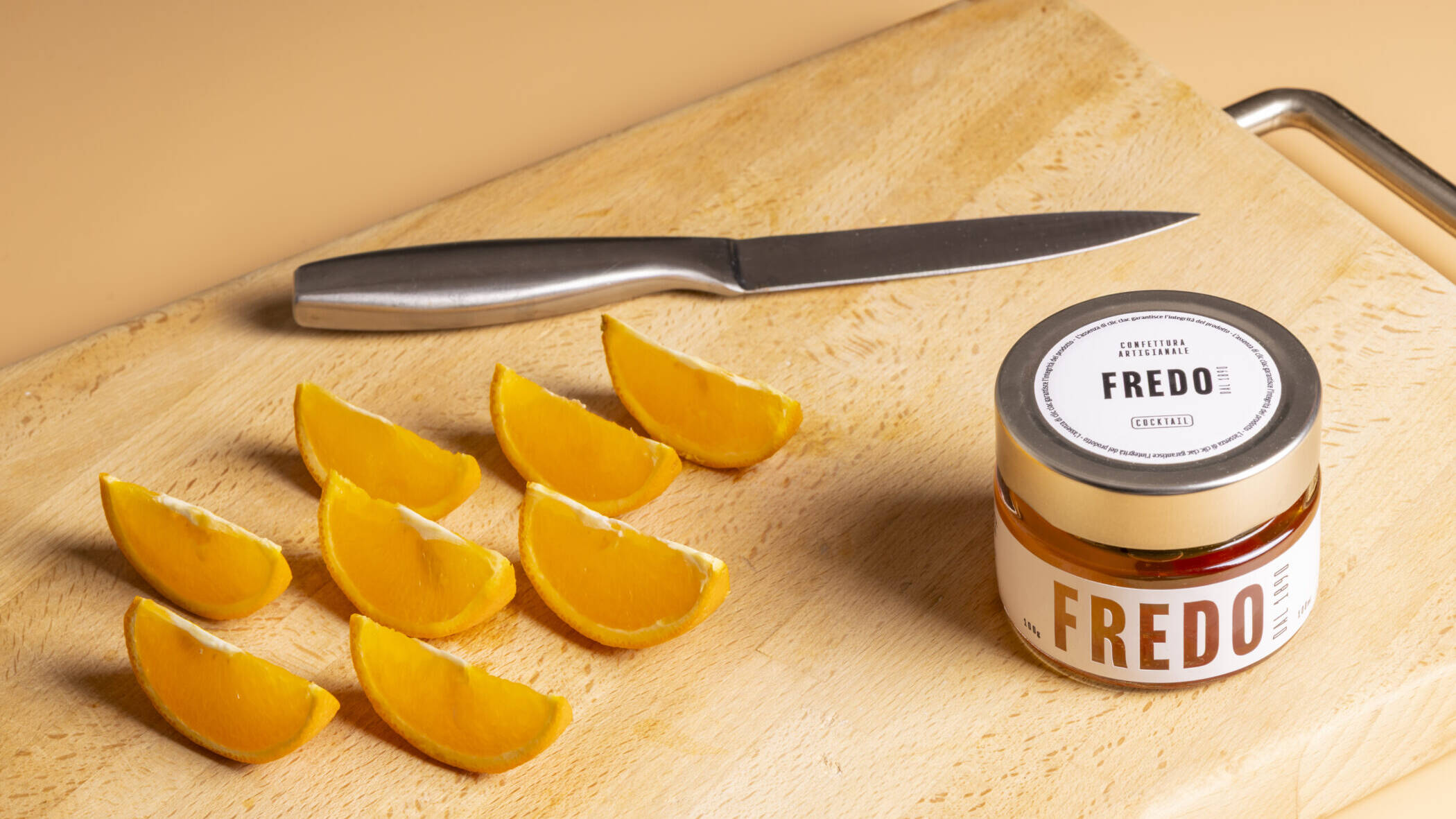
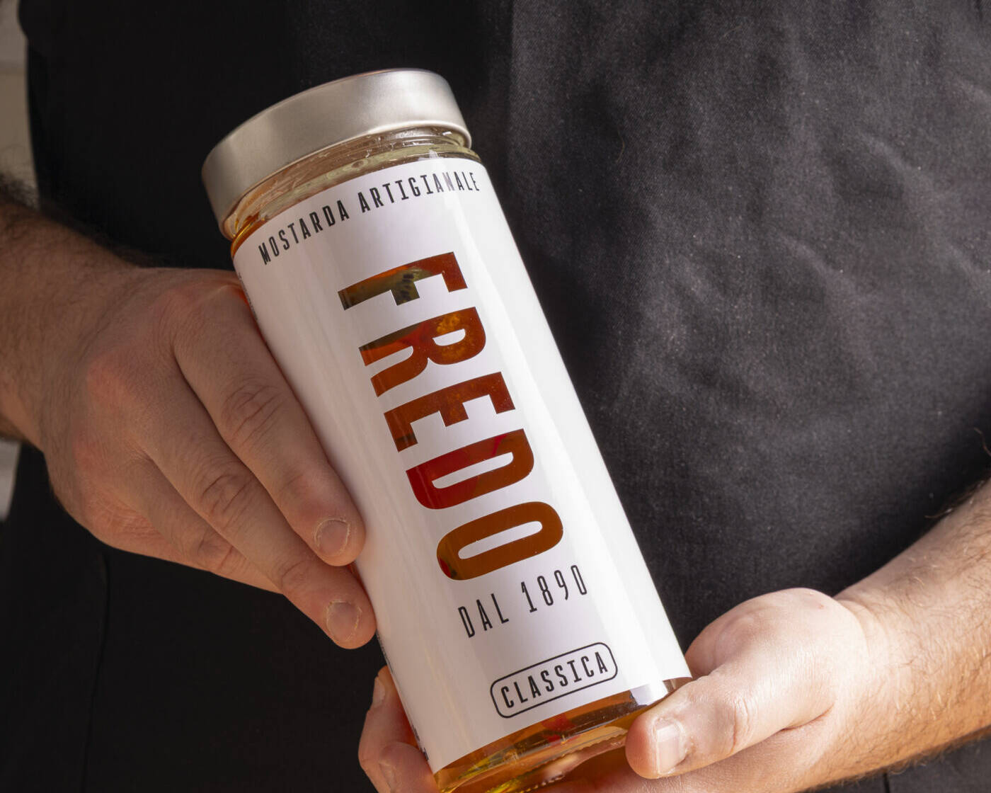
Label Design
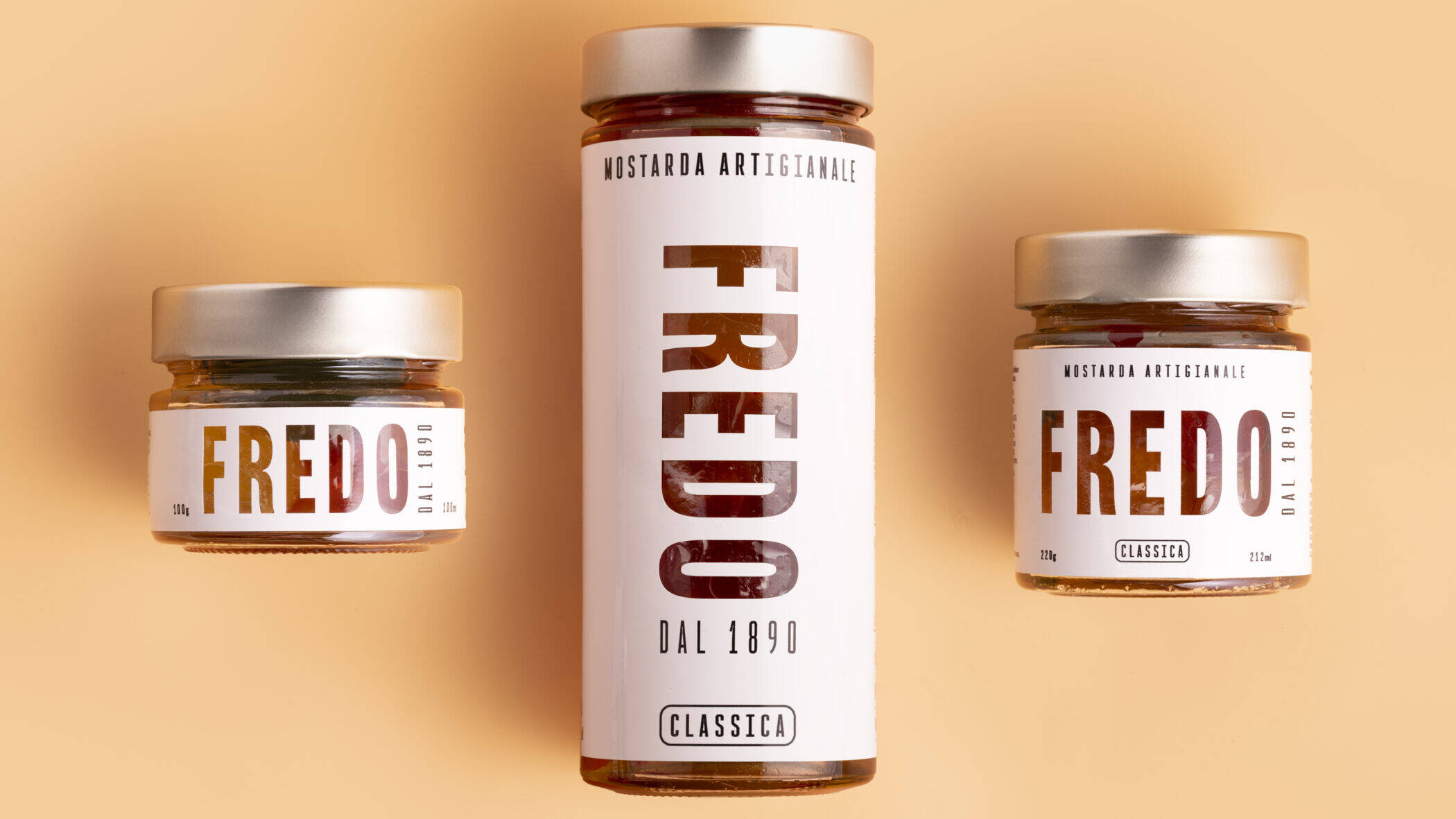
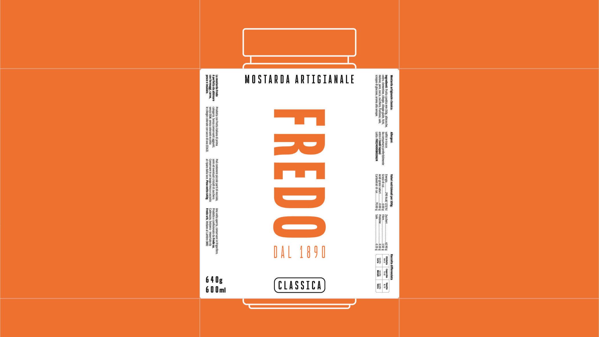
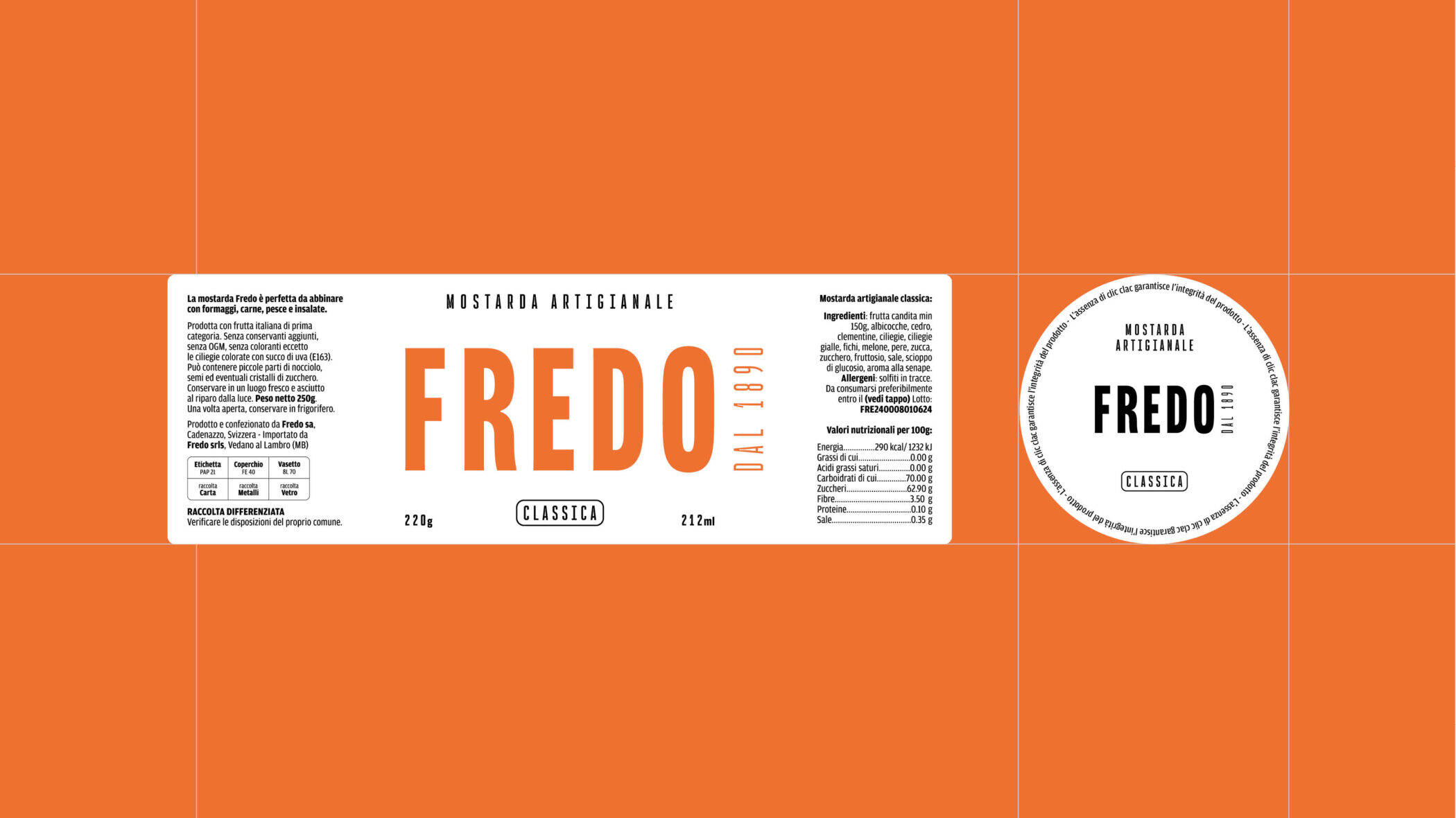
The new label is minimal and die-cut around the logo, establishing a direct dialogue with the product. This visual choice transforms the jar into a refined object, balancing elegance and clarity while letting the brand and content speak together.
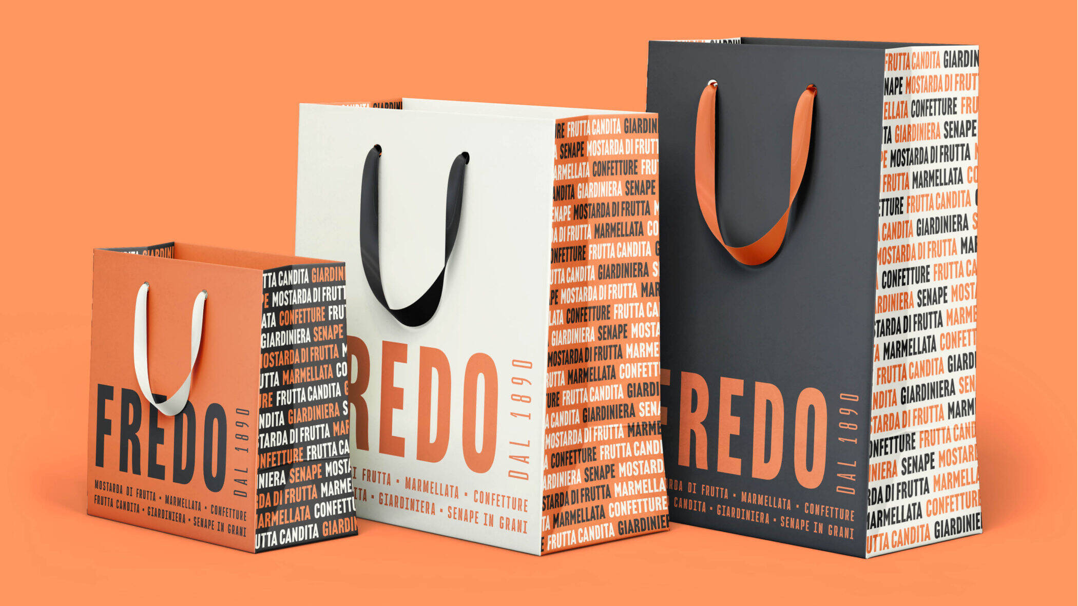
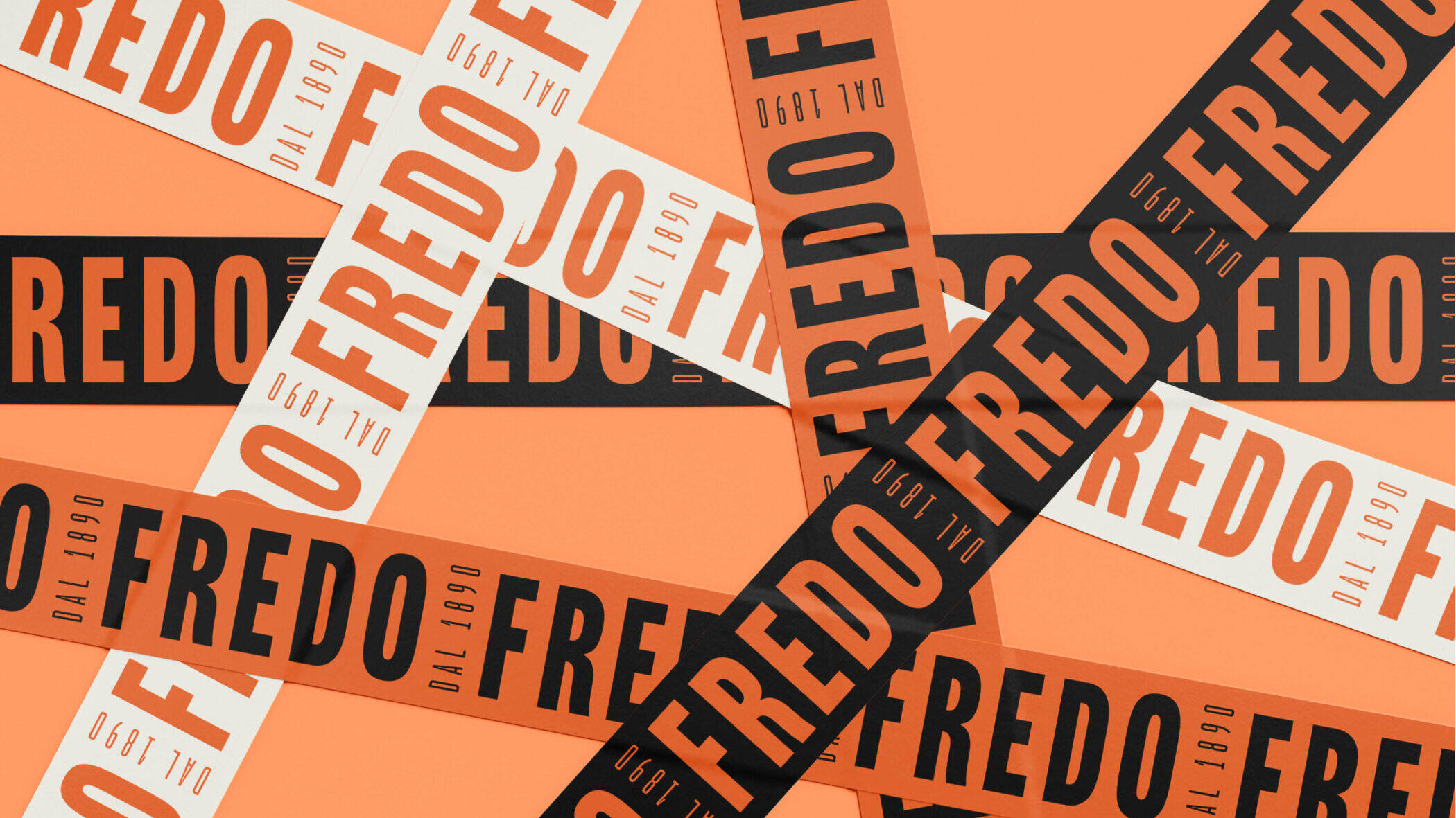
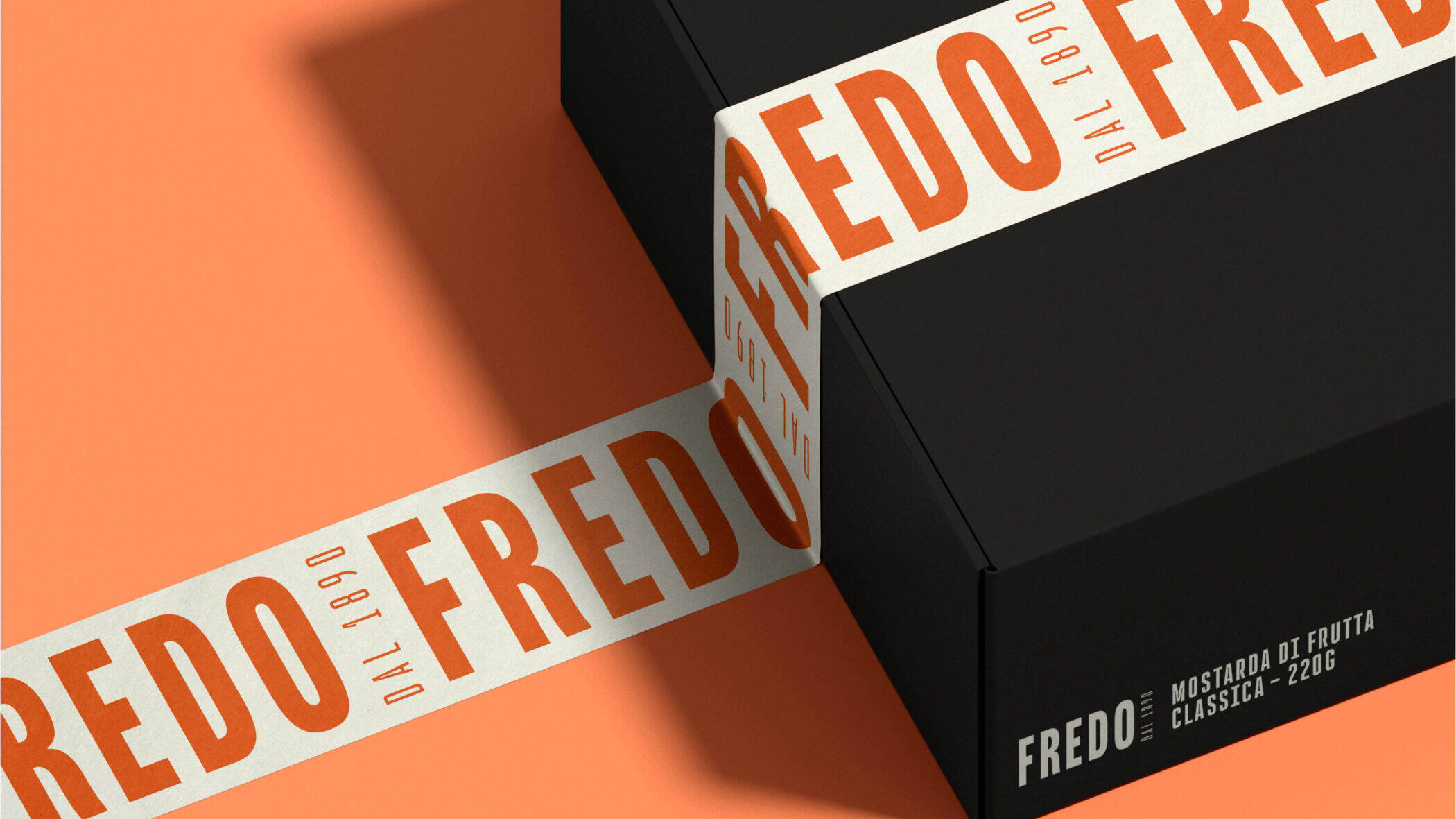
Offline Branding
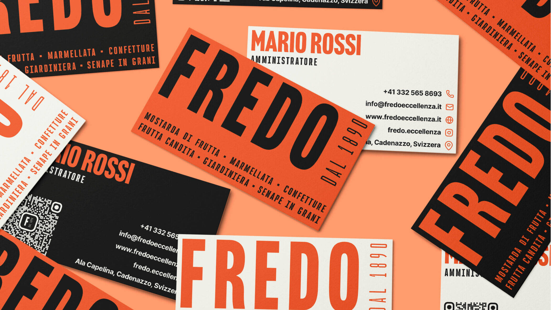
Fredo’s offline materials reflect its new identity with rigor and style. From Swiss-inspired business cards to branded tape and aprons, every element reinforces coherence and communicates craftsmanship through a refined, typographic pattern referencing the brand’s product range.
Social & Website
Fredo's digital presence has been redesigned with clean, expressive visuals and a simple, accessible tone. The website is structured for intuitive navigation, while social formats highlight product stories, craftsmanship, and raw ingredients through consistent, authentic imagery.
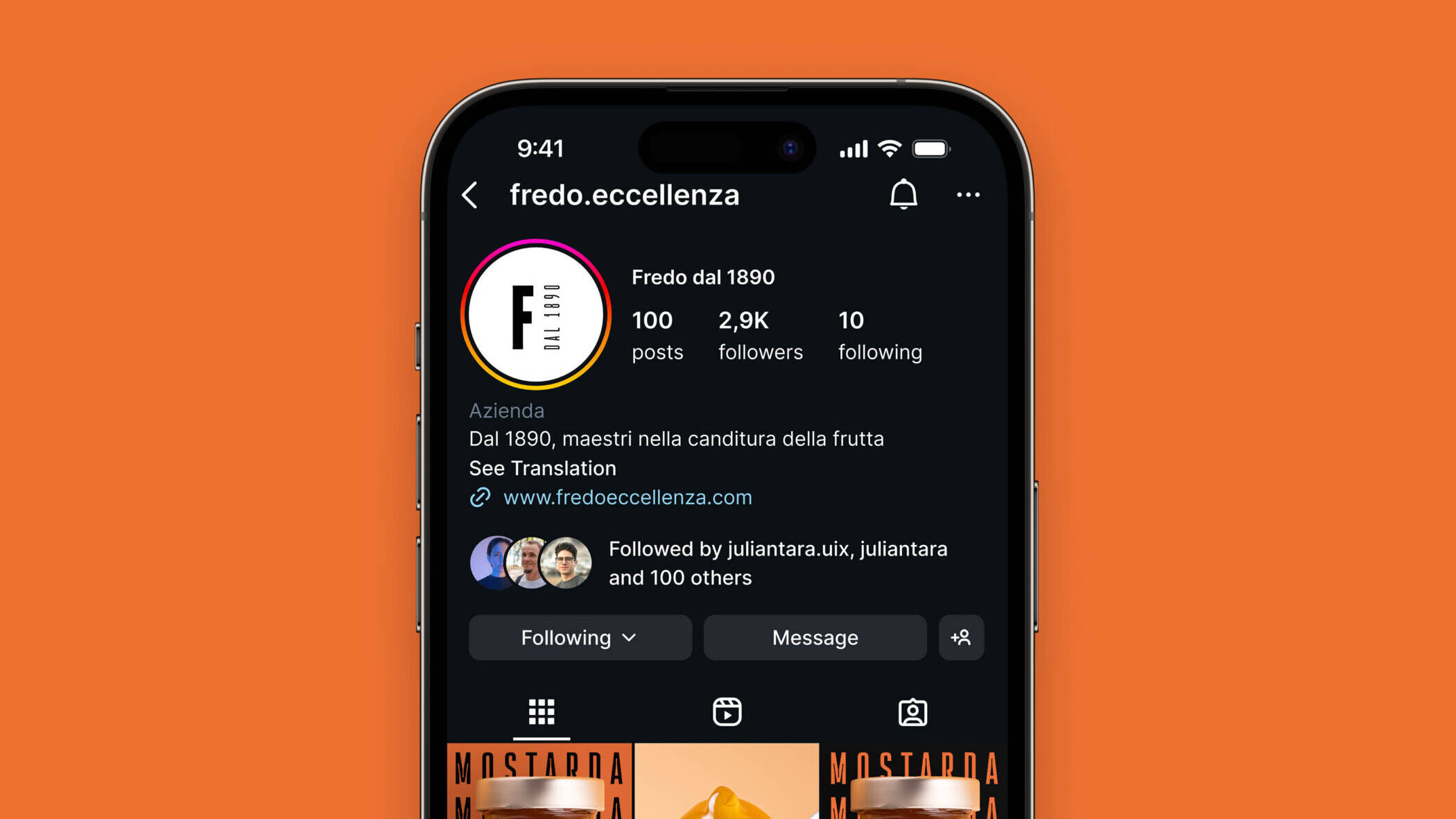
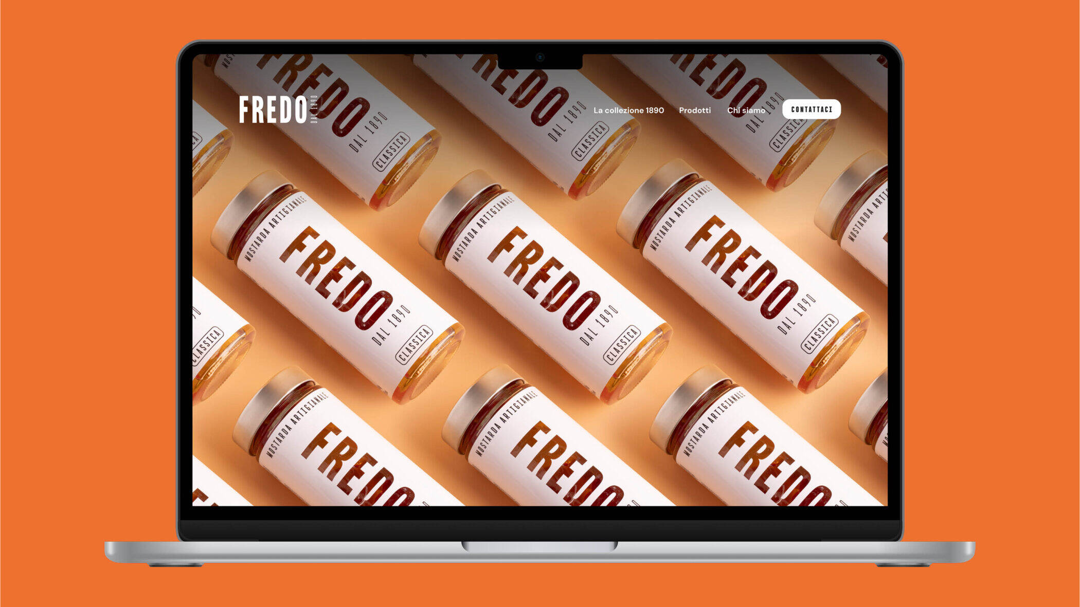
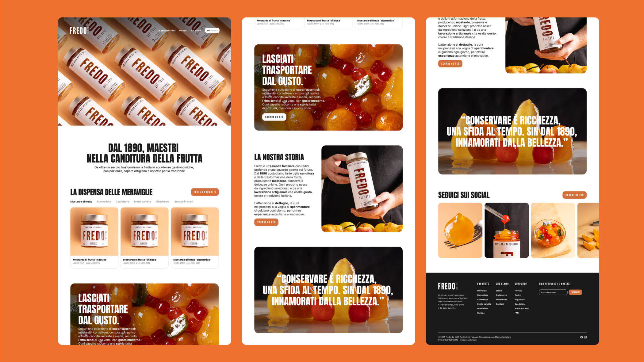
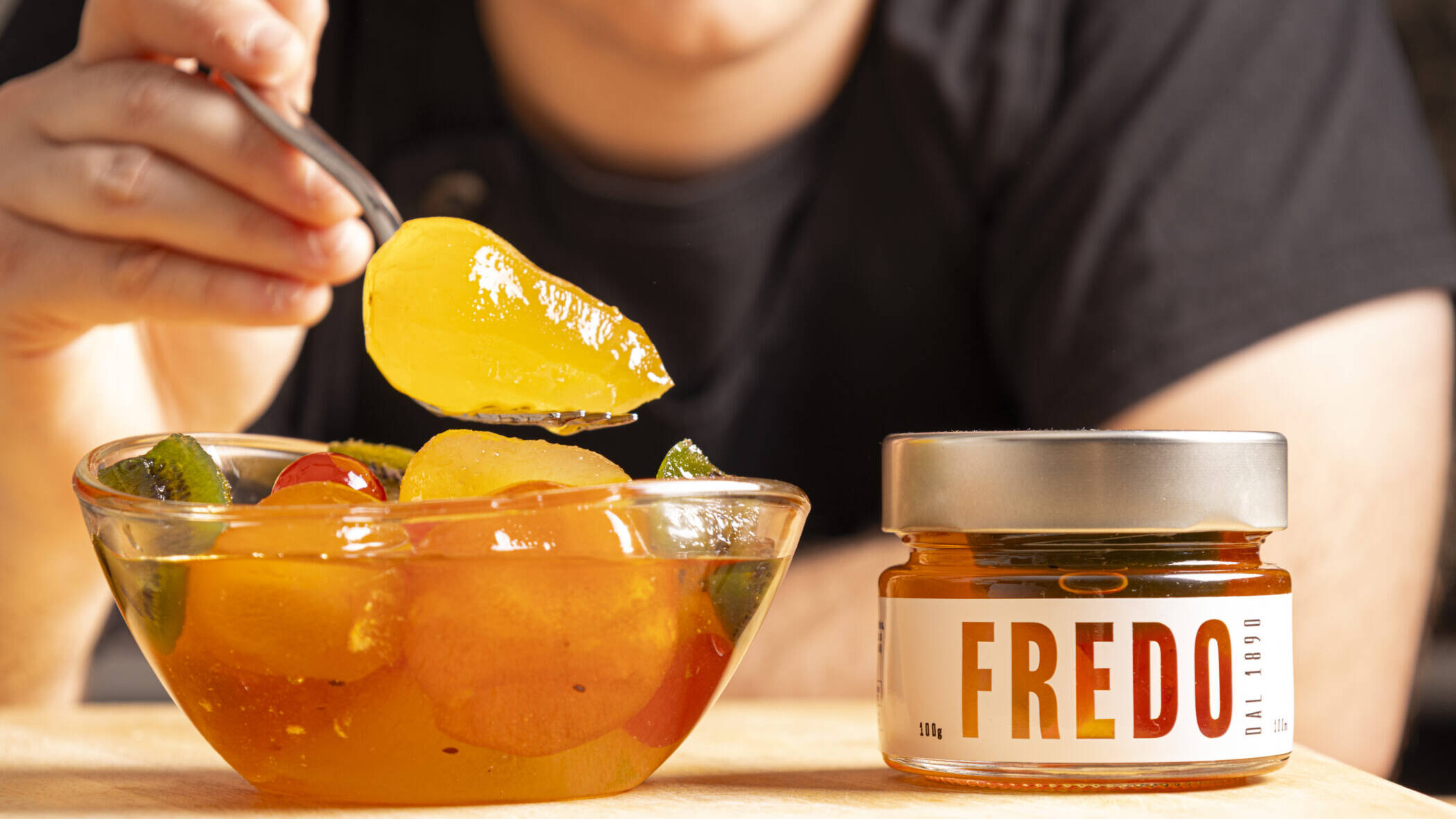
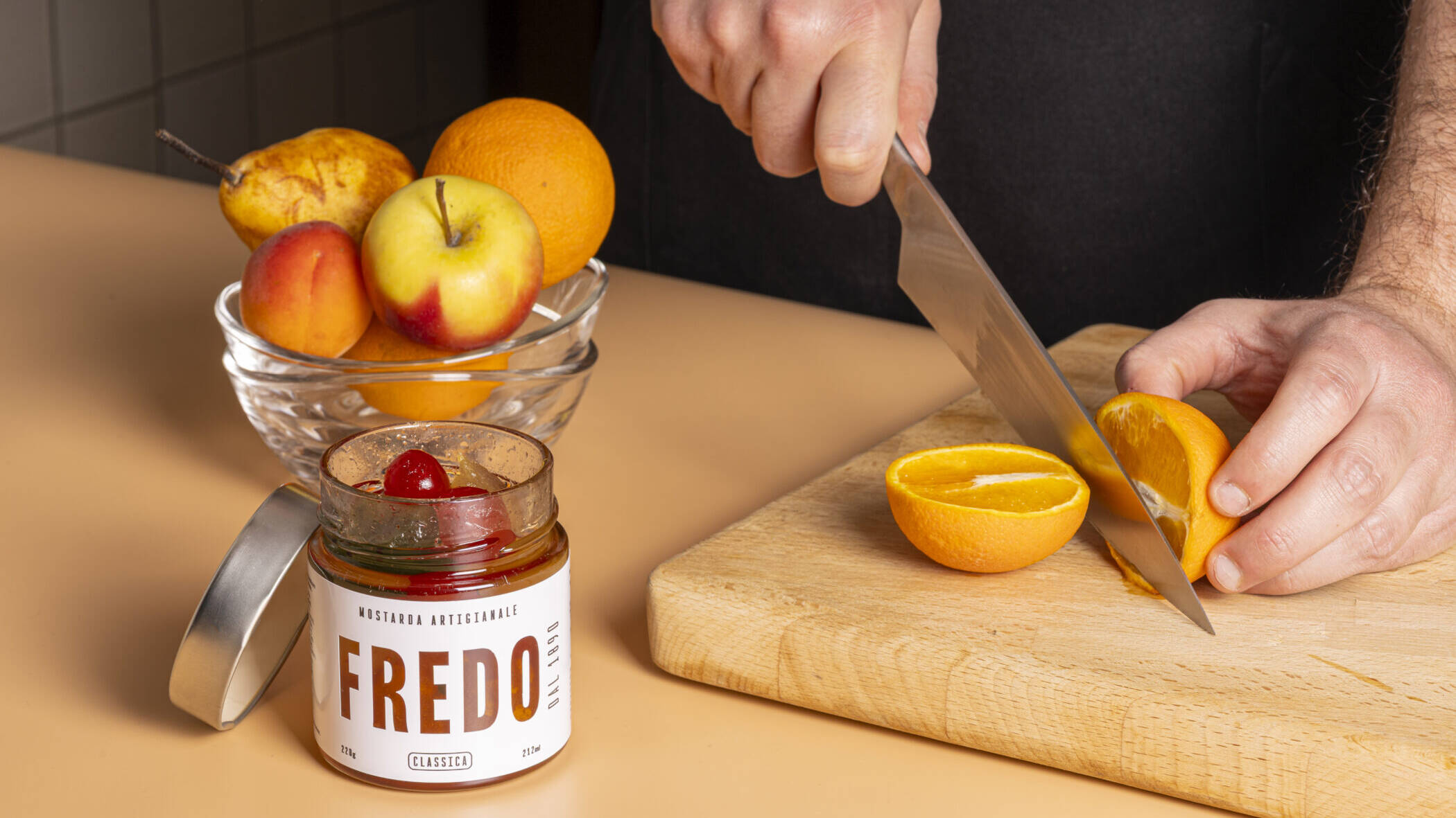
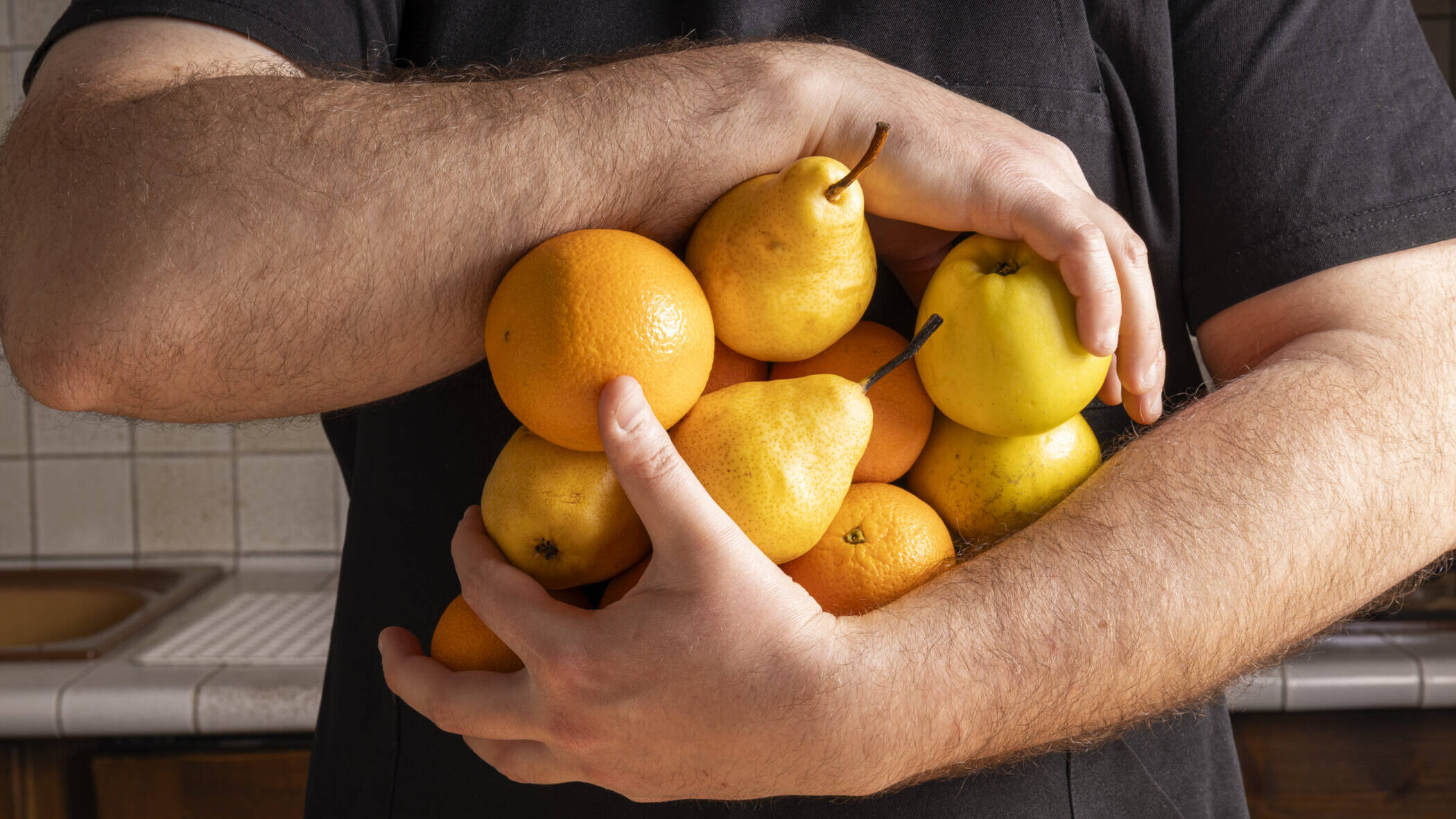
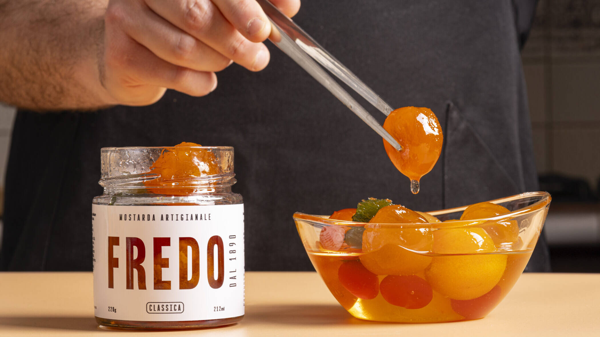
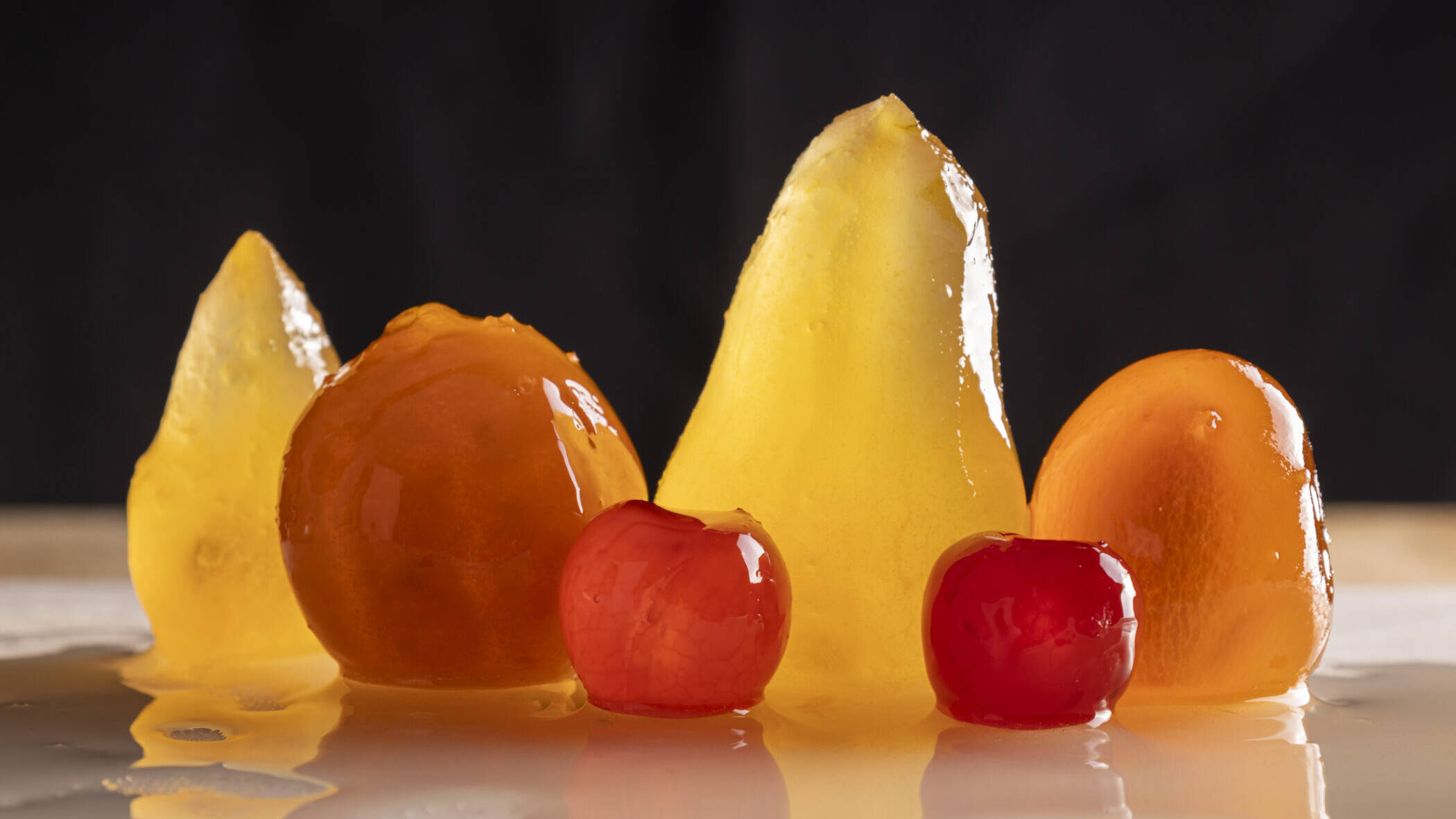
Photo Shooting
Photography follows an essential and natural direction, focusing on textures, gestures, and the human touch behind each product. Divided into still life, production reportage, and lifestyle shots, the imagery enhances Fredo’s premium positioning and artisanal soul.